SPX (S&P 500 Index) Charts
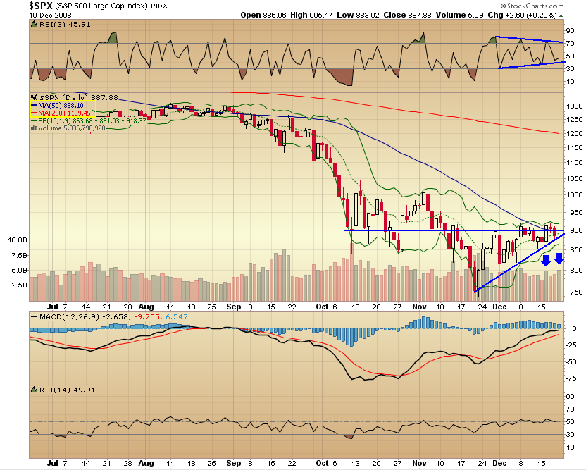
Daily $SPX chart as of December 19th close
A few positives when lines drawn like this (click to enlarge), and volume is down on “red” days. The negative – Bollinger Bands are very narrow, usually this doesn’t end well. And with lines drawn another way (desceding upper line), we have a bearish formation, instead of this bullish one.
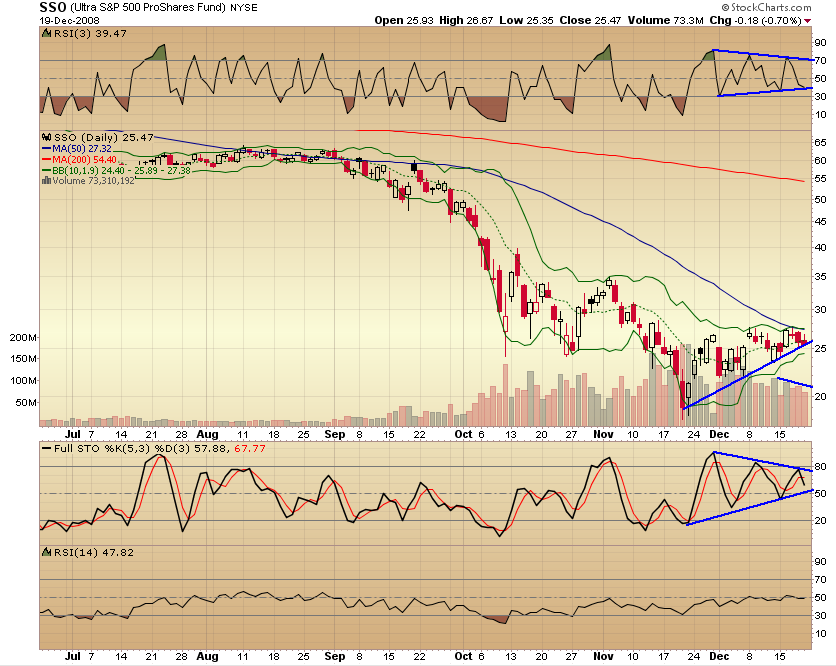
SSO (Ultra S&P ETF) indicators are more “in focus”. Lots of triangles that should soon resolve, one way or another.
Weekly $SPX chart as of Dec 19 close
Last time we had dojis and narrowing BBands narrowing just like now was right before the waterfall decline. MACD is improving, but not out of the woods yet.

And here’s SSO Weekly for comparison
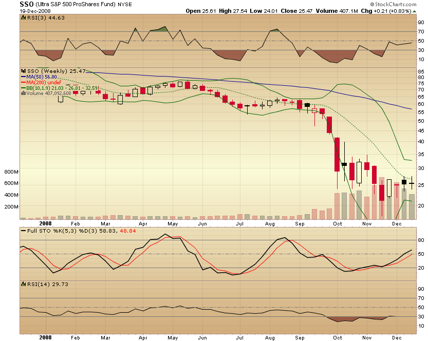
Look at that volume 🙂 in the last couple of months! Again, a bunch of dojis forming, narrowing BBands, Stochastics are about to get overbought, without much advance.
I have no clue what’s going to happen, but leaning towards bearish side more than bullish. Not planning any trades before the New Year or until we get a sign about where this is going.
Kat,
Looking at your charts and indicators, again, I am bullish.
jog on
duc
Duc,
I’m neither. Like I said – I’m not going to trade until I’m confident and at least some of my trades go my way. Need to build the confidence again!
I’m going to have to go with neutral here. Still planning on doing a bunch of SOH, until I have a better sense of things.