Long Term Gold Charts from Valcambi
I own a couple of bars minted by Valcambi (via Scotiabank). I used to think that all gold bars were minted by Credit Suisse 🙂
Valcambi have a few interesting charts on their Charts page. Here’s one:

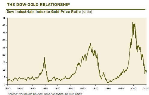
1-5 DOW/Gold ratio can be achieved in two ways: either gold will go up, or the DOW will drop.
I’m betting on gold going higher. Crazy as it sounds, I believe there’s going to be a major war in a year or three. There, I said it.
EDIT: Here’s an even longer-term chart from elsewhere. Not sure what technical scenario applies here. Does every new peak exceed the previous? or will it only work 3 times and the pattern will change? More questions than answers, sorry.