Average House Sale Price, 2015 to 2025 – Toronto Area
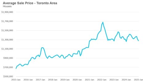
The chart represents the average sale price of houses in the Toronto area over time. In stock trading, this price pattern resembles a parabolic rise followed by a correction and stabilization, which is often seen in speculative bubbles or cyclical markets.
Key Observations
Strong Uptrend (2015-2022) – A steady rise, followed by a sharp acceleration from 2020 to early 2022.
Sharp Peak and Decline (2022) – A bubble-like top where prices peaked sharply and then dropped rapidly.
Sideways Consolidation (2023-Present) – After the correction, prices seem to be moving in a range, fluctuating but not showing a strong new uptrend.
Comparable Stock Trading Pattern
Blow-Off Top: This pattern is seen when an asset experiences rapid price appreciation, followed by a steep decline. It resembles parabolic patterns found in speculative stock or crypto markets.
Head and Shoulders: If we look closely, the chart might suggest a broad head-and-shoulders pattern, which is a bearish reversal indicator.
Support and Resistance: The price appears to be bouncing around a level (~$1.3M) but is failing to break into new highs.
Prediction: Up or Down?
Bearish Outlook (More likely): Given the overall pattern, we might expect further declines if economic conditions (interest rates, demand, supply) remain unfavorable. The market has already corrected from the peak, and if it forms a lower high, we could see another leg down.
Bullish Scenario: If demand stabilizes and economic factors support growth, prices could hold at this level and potentially rise again.
Conclusion
The most likely scenario is continued consolidation or a slow decline unless a significant economic or policy shift boosts demand. If you’re using this chart for a housing market decision, consider external factors like interest rates, inflation, and government policies before making a final judgment.